Experiential graphic design is so much more than branding and logos, artwork, wayfinding, signs and displays. Modern experiential graphic design is experiential design. It’s a multi-disciplinary approach to building an environment that evokes emotions and tells a story. When brands employ successful experiential graphic design, they are connecting with their target audiences through spatial storytelling experiences.
Graphic design is a part of every brand event, activation, or experience. Experiential graphic design contributes to how people perceive and interact with a space. These two-dimensional design elements contribute to the environmental design of a space, narrating it and orchestrating its use by visitors and guests.
In this article, learn how the best brands use experiential graphic design to give purpose to built environments and create meaningful interactions with the people who pass through and inhabit them.
What is experiential graphic design?
Experiential graphic design is that part of experiential design that involves the selection and placement of two-dimensional visual elements, such as signs, artwork and murals, or other displays in a built environment. Through placement, color selection, typography and other design choices, experiential graphic designers create 2D elements that integrate with, and enhance, the overall effect of a place.
Experiential graphic design is sometimes called environmental graphic design because its aim is to purposefully manage how people who enter a defined indoor or outdoor space experience that built environment. In fact, experiential graphic design is a subset of environmental design.
Environmental design is the process of planning and shaping a space to achieve a specific goal, elicit a response, inspire a feeling, or convey a message through design elements.
Both environmental design, which encompasses everything from structural elements to lighting and sounds choices, and experiential graphic design support the execution of experiential design.
What does this all mean in practice?
Spaces planned without intentionality can be bland, unmemorable and fail to support desired objectives. Experiential design creates spaces in which every component is selected to support a unique, unified and memorable message. Considering the experiential impact of a space’s 2D elements when planning a space maximizes its potential to communicate, guide, serve and delight visitors.
Where are the principles of experiential graphic design applied?
The principles of experiential graphic design should be applied whenever an interior designer, architect, brand manager, event planner, exhibition designer—or anyone else—plans a space that includes wall decor, signs, or other two-dimensional visual elements.
A few of the places you’ll find experiential graphic design include:
- Corporate offices and other workspaces
- Public buildings and outdoor spaces
- Public and private art installations or exhibitions
- Retail stores, malls, and entertainment centers
- Location-based entertainment venues
- Education centers
- City-wide conferences or events
- Public and private mixed-use facilities
- Branded events and activations
As more people look to brands to provide interactive, in-person experiences, this latter category deserves special attention.
How experiential graphic design makes brand experiences memorable
Experiential graphic design is critical for companies seeking to raise awareness and attract people to their brand through permanent installations or brand activations. What we see affects how we feel. Signs, decor, color, and all the other 2D elements within the space help set the mood, express the brand’s values and build emotional connections with consumers.
Functional two-dimensional visual elements also contribute to linking brands with positive experiences. Wayfinding signs ensure people don’t get lost or miss out on anything. QR codes and graphics, including branded URLs, connect offline events and experiences to the brand’s online properties and promotions. Thematic displays provide photo opportunities that expand the reach of local in-person events to audiences on social media.
Five examples of brands using experiential graphic design to wow audiences
1. Slack transforms its digital space into a real one at SXSW 2022.Slack put its brand personality on display at SXSW with an interactive environment that included plenty of photo opportunities and fun for fans of the communication app. Its colorful outdoor lounge featured graphics displaying business-casual emojis and witty phrases along with the brand’s iconic logo.
This brand activation gave SXSW attendees a physical place to relax, unwind, and communicate much like the Slack app does in the virtual world.
2. Shipt decks out a school bus with irresistible graphics for a multi-city back-to-school tour.
Same-day delivery company Shipt asked customers what they needed to prepare for the back-to-school season, then used a combination of 2D graphics and 3D pieces to display the results on its Shipt “Back to School Bus.”
Using 2D elements enabled the brand to pack a lot of information into a narrow space. The bright, primary colors of the design stay true to Shipt’s style and coordinate with its other online and offline promotions.
3. Bush’s beautiful bean museum creates an experience chock full of beans and photo ops.
Guests can “roll that beautiful bean footage” at The Bush's Beans Visitor Center Museum, posing in front of the branded step and repeat wall like bean celebrities (Duke the dog not included).
Experiential graphic design elements include a colorful US map and history wall sharing the brand’s story and a larger-than-life 3D bean can covered in graphics to make it look like the real thing.
4. Reddit’s Cannes Lions recent experience puts the interactive writing on the wall.
Reddit brought its fun, irreverent style to Cannes Lions with an inviting and intriguing Reddit Explorers Club. The clubhouse was decked out with the brand’s distinctive orange color and 2D and 3D representations of its one-of-a-kind mascot.
Real Redditor posts were on display inside while the exterior featured an interactive screen where passersby could upvote or downvote the displayed comments.
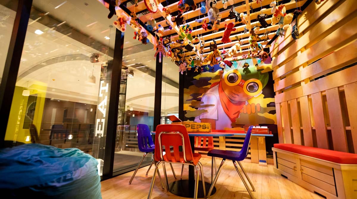
5. Chicago Children’s Museum inspires children to create under the watchful eyes of Flyboy.
The Chicago Children’s Museum’s Art Studio is a colorful, interactive, inclusive space designed to delight children and inspire them to explore their creativity. In keeping with that theme, artist Hebru Brantly’s Flyboy watches over art explorers from a large mural.

The Flyboy theme is carried throughout the space with coordinating wall colors, additional graphics and even a Flyboy floor covering.
Build an engaging, memorable experience with graphics that make a statement
The best experiential graphic design is intentional in purpose and thoughtful in preparation. These design elements contribute to the creation of coordinated, experiential spaces that make a positive impression on the people who visit and occupy them. With the help of an experienced, full-service experiential graphic design partner, your brand can create spaces that have a powerful, positive effect.
Learn how an experiential graphic design company can provide the unified design, production, and strategy that sets truly innovative experiences apart by scheduling an no-obligation strategy session with Bridgewater Studio today. Our experienced team can expertly guide your project from conception to completion.


.png)
.png)
.png)


